Case Study : Boxed Gallery and Filtering
Like any other e-commerce company, our gallery and the ability to find products is paramount to Boxed. While industry-standard ux/ui patterns for galleries have always been followed, we’ve introduced a number of changes, tests and optimizations over the years while keeping the experience more or less consistent. For example, back in 2014 there was no way to add items directly from a gallery page, users were required to navigate to product detail pages in order to add to cart. In 2015, in addition to adding CTA’s for every product, switching up the navigation allowed for a side navigation to aid users in finding categories and subcategories. In 2016 we added a fixed cart to the side of desktop gallery pages, in 2017 we overhauled the navigation again, in 2018 a new styleguide was introduced and now in 2019 adding filters is in progress.
Check out the mobile web prototype for filtering here.
Checkout the desktop web prototype for filtering here.
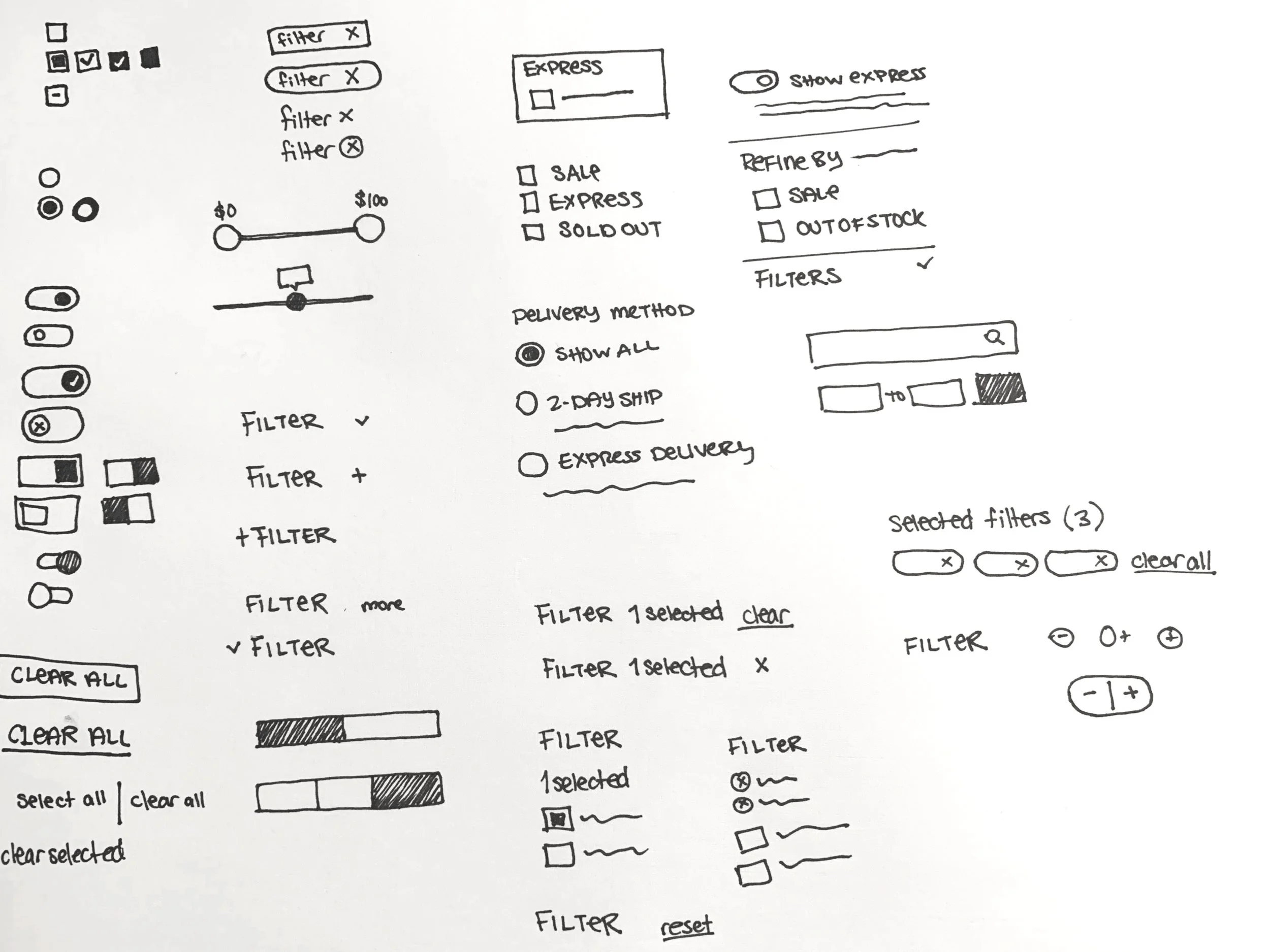
Competitive analysis and paper sketches were completed to define benchmark patterns and identify which would work for our uses. The Boxed product selection is much smaller than than of an Amazon, Home Depot or Etsy, so an best-in-class system would need to be heavily modified.
Rough wireframes were created in order to lay out different scenarios and learn how to best organize information.
Once a direction was selected, the wireframes were done in greater detail and it was ensured that everything would work responsively.
This was a particularly fun project because so many subtleties exist within ui patterns for filtering throughout the web, from the way checkboxes are depicted to where active tags are displayed, there were many outcomes to consider when deciding what was right for Boxed. Take a look at some of the designs considered for each element of the project.
Design choices were made easier with the help of our styleguide, and many new pieces such as toggles were added and checkboxes and radio buttons were updated.
Because of the complex nature of the filtering interactions, I took the time to do extensive annotations for each part of the feature on desktop and mobile web to ensure that all members of the development and QA teams could remember the functionality after our review meetings.
We prototyped the feature and completed 3 user testing sessions: 2 for web and 1 for iOS in order to ensure that our assumptions were correct and people were able to use the feature. Since we drew heavily from existing patterns, our users flew through the tests with little to no problems.
A short flow for desktop web


