Case Study : Boxed Product Detail Page
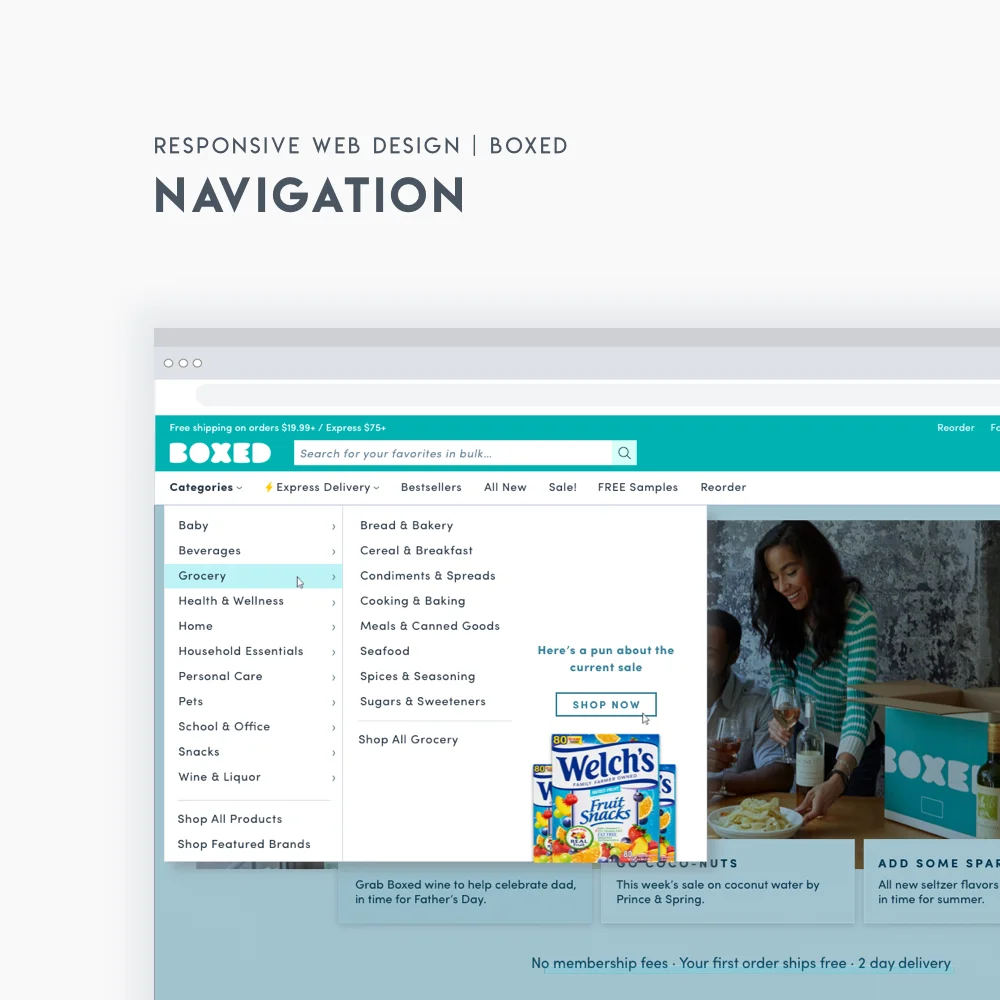
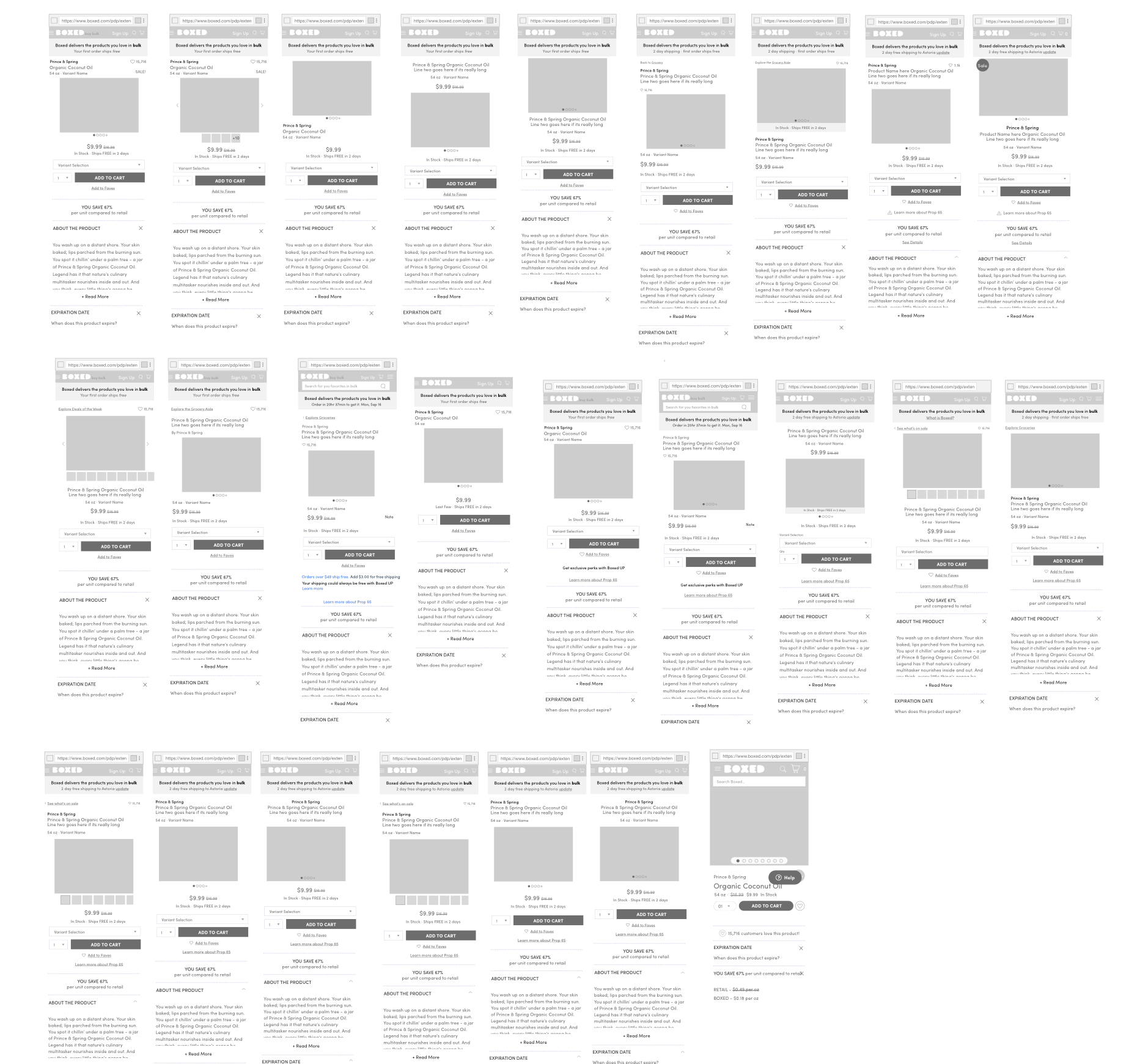
Below you can see the progression of the Boxed Product Detail page from 2015 to present. PDP’s are the most trafficked pages with recent trends showing that the majority of users are now entering our site through the pdp instead of through the homepage. I was the lead designer on both redesigns, version 2 was completed in 2016 and version 3 in 2018, showing our site is constantly evolving and growing. The experience is becoming increasingly complex and informative as we learn new trends, pair up with new teams such as data science.
Each feature sprint starts with documentation. An audit of the current experience is compared to company and feature goals/success metrics. Competitive analysis comes from our top competitors plus those brands setting industry standards. Research is completed for desktop and mobile through the Baymard Institute. Users and stakeholders are interviewed.


Black and white wireframes are rapidly created, every different way to embody the ideas from research and goals of the project. Depending on the project, scale, mood and speed wireframes will be done digitally or on [recycled] paper, oftentimes it’s both! The best wireframes are printed out and brought before the larger team for critique. Critiques can be done in person or via Invision if the team is remote. We make real time changes by cutting up print outs and making notes.


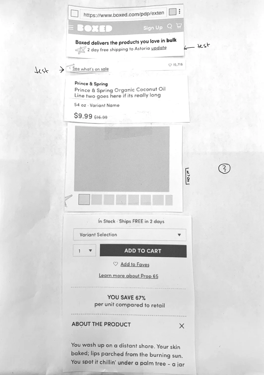
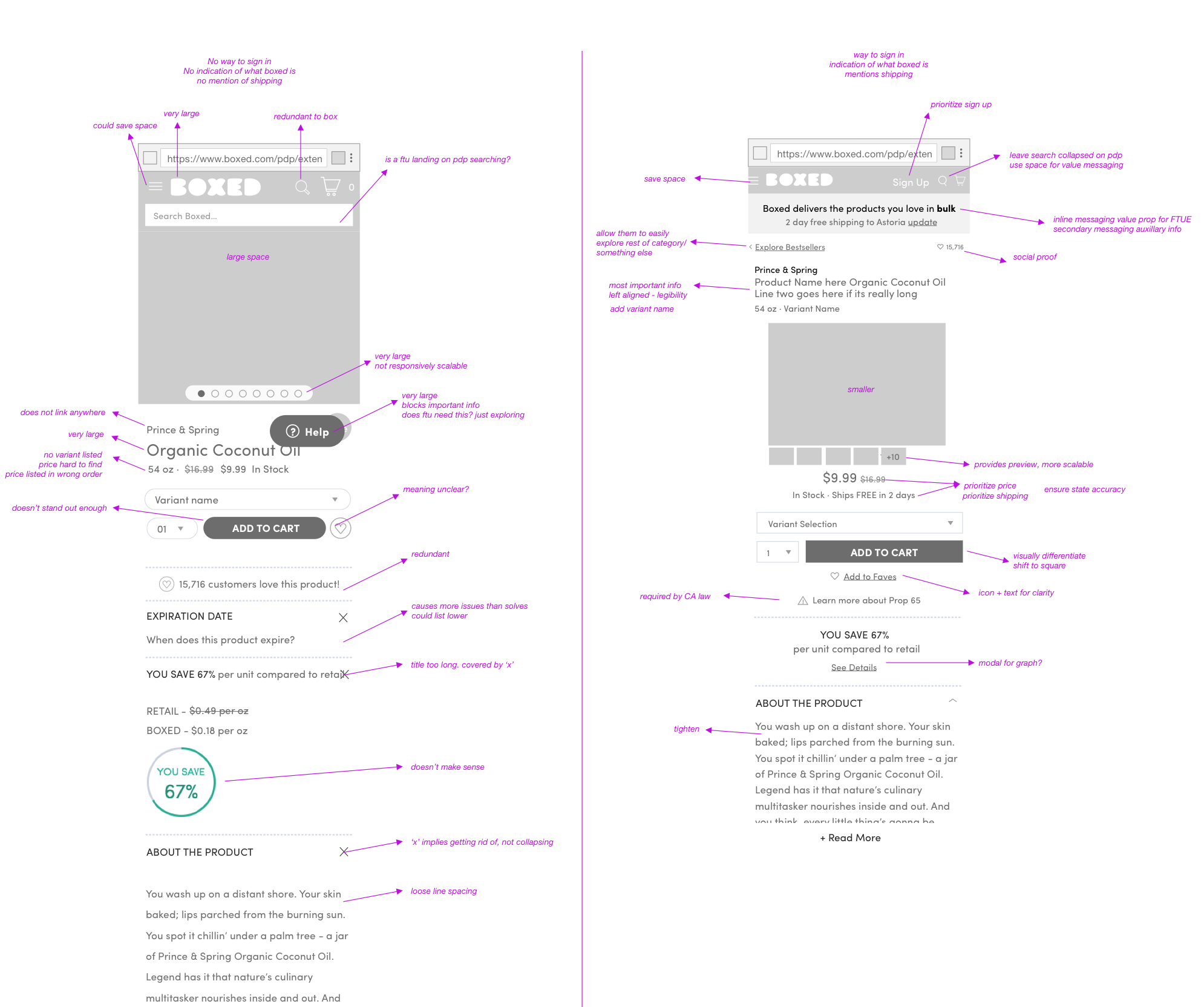
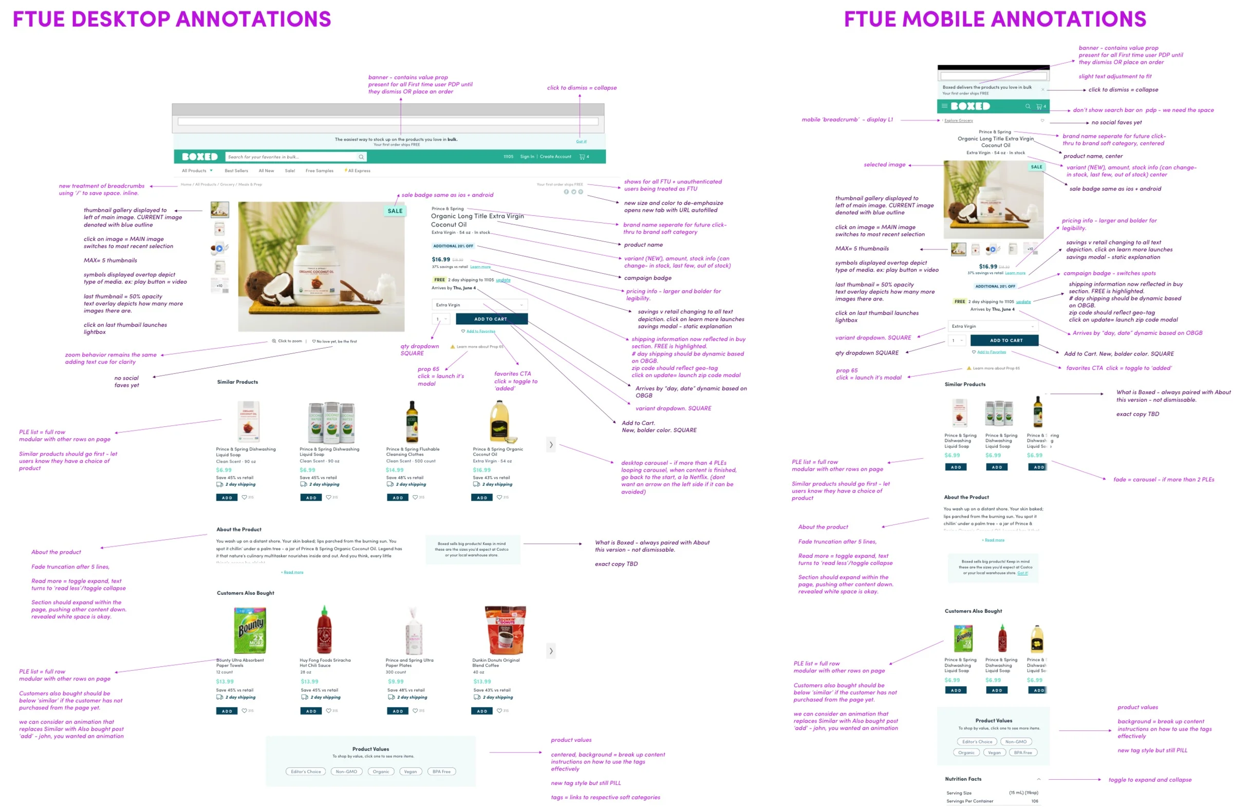
Final wireframes are created and annotated (I love annotating in purple) all changes and some functionality is noted. These designs are reviewed with stakeholders first, followed by with developers and the QA team. Final changes are made. Ui and visual experiments are made in the early stage of the process as well in a purely exploratory manner, again options are created rapidly in order to get all ideas down on ‘paper’.


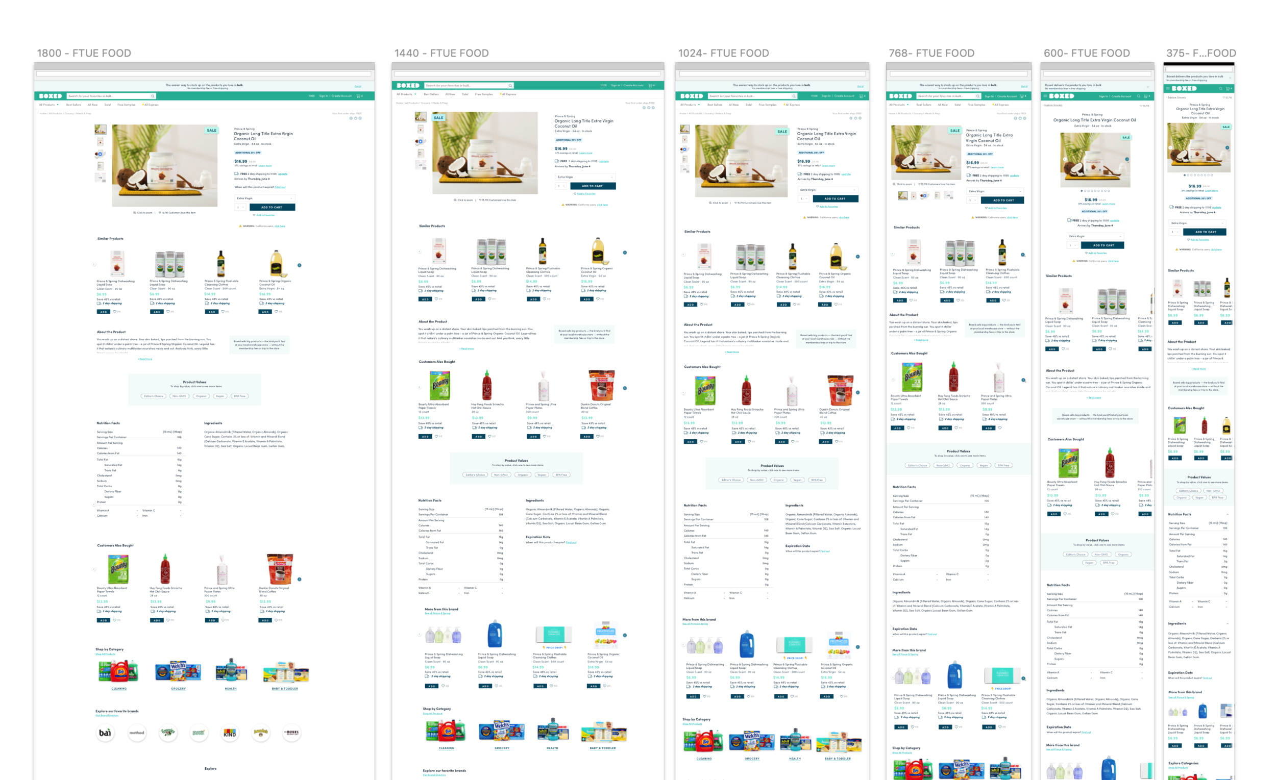
Visual design is applied from the styleguide as one of the last major steps in any feature. Any new ui and visual design is reviewed by creative directors and added to the styleguide for future use. All responsive snaps are built out at this point, now taking care to address tablet sizes, since Desktop and Mobile are given highest priority.
Artboards are created for states, edgecases and unique user flows.


A final annotation document is created for the development and QA teams noting all new functionality, interactions and important pieces on static experiences. For a flow, a prototype will be made in Invision or Principle.

But really, is our work ever done? The beauty of product is that we never have to place all of our hopes into a single print run, we can test until we’re happy, then wait a month and test some more. Here are some of the tests we’ve been running on this page alone in the past few months since the redesign launched


Want to see more from Boxed?