Evolution of Navigation: A Multi-Year Retrospective
Like all core functionality at Boxed, our navigation system has undergone a rigorous, multi-year evolution to keep pace with scaling inventory and shifting user behaviors. This retrospective traces the architectural journey from our 2014 foundations to the present day, navigating the transition from static side-rail navigation to centralized mega-menus and high-utility filtering systems. This chronological walkthrough highlights how each iteration solved specific scalability challenges while maintaining the platform's signature "wholesale-made-easy" experience.
2014: The Fixed-Width Foundation
In our initial 2014 launch, the navigation reflected a fixed-width, left-aligned architectural model. During this phase, the system was non-responsive, utilizing a persistent global menu that remained identical across all user touchpoints. While this provided a consistent anchor for early adopters, the lack of contextual awareness and mobile optimization became the primary catalysts for our first major structural pivot.

Strategic Architecture & Dynamic Hierarchy
In 2015, we executed a comprehensive overhaul, transitioning from a static sidebar to a conventional top-navigation model featuring integrated mega-menus. To provide deeper contextual support, we introduced a dynamic inline side-navigation that adapted based on the user's category selection. At the time, this centralized architecture perfectly complemented our curated product catalog. However, as our inventory scaled rapidly over the following year, the resulting increase in category depth pushed the vertical constraints of the mega-menu beyond sustainability, signaling the need for a more elastic, scalable solution.

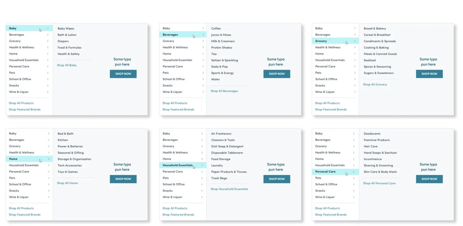
Introducing Multi-Tiered Taxonomy & Scalable Interactions
To accommodate our expanding product catalog, we transitioned to a tiered navigation system that introduced a clear hierarchy of categories and subcategories. This structural shift allowed for a "progressive disclosure" model—revealing depth only upon user interaction to maintain a clean interface. While this core logic remains the foundation of our current site architecture, the visual layer has been iteratively refined to align with our evolving design system and brand standards.


High-Fidelity Iteration & Component Standardization
In our most recent evolutionary cycle, the focus shifted toward high-fidelity visual optimization and interface effectiveness. To ensure a best-in-class user experience, I conducted an exhaustive exploration of our primary navigation components, stress-testing diverse iconographies, typography-led link styles, and color palettes. By meticulously mapping every architectural variation for the main navigation, we were able to distill the interface down to its most intuitive form, ensuring that our visual design standards not only supported the brand's aesthetic but actively enhanced user wayfinding and click-through efficiency.

Once chosen, responsive designs were created for various user types.

Our current category structure (right) is now well supported by our navigation and menu designs.
The final progression
2014-2019
Want to see more from Boxed?


